At Roland I have worked on a variety of projects from print to social. Here are a few examples.
TThis project represents a meticulous re-design of Tyler, the Creator's 2013 Hip-Hop Album, WOLF, with a specific focus on addressing the challenge of potential audience dismissal due to explicit content and language. As a talented musician with the ability to connect with a broad audience, Tyler's work often faces initial skepticism.
In response to this, the re-imagined design is strategically crafted to convey the laid-back, playful, and celebratory ambiance inherent in the music, offering a more accessible visual narrative. Notably, the design extends beyond the album cover, encompassing merchandise that complements the overarching aesthetic vision.
Particular emphasis is placed on encapsulating the gravity of the album's primary thematic focus, 'WOLF,' a character meticulously produced by Tyler. The visual composition not only aligns with the subject matter's seriousness but also highlights the playful and party-centric qualities embedded in the musical content.
Through this holistic redesign, including associated merchandise, the project aims to present a nuanced and inviting perspective on Tyler, the Creator's creative output while enhancing the visual appeal of the album in the context of broader consumer engagement.
The creation of the Vedette Concept poster served as a strategic visual project to support the ideation process for a potential drama series, envisioned for broadcast on HBO.
This initiative represents a deliberate design experiment, created with the intention of conceptualizing and supporting the narrative framework of this show.
The proposed series delves into the intricacies of the life of a vedette, centering around their experiences working at the iconic Moulin Rouge. This poster, which I directed, shot, and designed, contributed to the development and visualization of this compelling dramatic storyline.
As the designated designer for Plot 507, a boutique family vineyard, my creative skills extend to crafting labels that resonate with the essence of the brand. Rooted in a rich history of farming, Plot 507 embodies a profound appreciation for viticulture and a passion for oenological craftsmanship.
The label designs, meticulously curated, encapsulate the unique narrative of the vineyard, incorporating a profound love for wine and a sentimental attachment to their 2004 Land Rover, affectionately named Bingey. Harmonizing these elements, the labels not only serve as visual ambassadors for the wine but also evoke a sense of heritage, handcrafted work, and personal connection.
Symbolically, the blue and orange rectangles in the design represent the iconic doors of the home on the property, adding an extra layer of meaning to the visual storytelling.
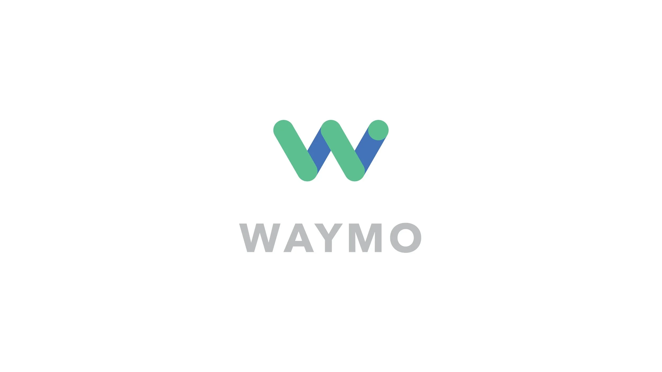
This is a concept application for Google’s Waymo self-driving car service.
This linocut project draws inspiration from President Barack Obama's final term in office. The central theme revolves around the phrase 'Darn Tootin,' strategically chosen to encapsulate the President's determined attitude towards concluding his presidency. The phrase symbolizes his unwavering commitment to pursuing what he deems right for the American people, reflecting a resolute and assertive stance.
The linocut design serves as a visual narrative, capturing the essence of Obama's determined leadership during this pivotal period. Through thoughtful composition and deliberate use of imagery, the artwork endeavors to convey the President's resolve to take decisive action on behalf of the nation.
The nuanced choice of linocut as a medium adds a tactile and expressive dimension to the visual representation, further emphasizing the depth of sentiment and purpose behind the artwork. By melding symbolism with artistic technique, this project aims to offer a sophisticated and impactful portrayal of President Obama's mindset during the culmination of his presidency.
TThis design initiative centered on the conceptualization and branding for a fictional grain-free baby food company. The guiding mission statement for the project was formulated as follows: 'Coming from the Land of a Million Vegetables, we leverage recipes from the dedicated father and chef, Kevin Lane, to offer a wholesome range of grain-free baby food. Our aim is to infuse the meals with the love and care that parents have for their little ones.'
Through a strategic design process, I translated this mission into a successful and cohesive brand identity for Kevin Lane's grain-free baby food. The visual elements and branding choices were meticulously curated to align with the company's mission, effectively communicating the quality, care, and nutritional benefits associated with the product. The resulting design not only captures the essence of the brand but also resonates with the target audience, establishing a compelling visual setup for Kevin Lane's grain-free baby food.
This is a poster for the Folly Jazz Series, Cyrus Chesnut Trio Night. His band focuses on taking classical music and giving them a more modern jazz vibe. I wanted to focus on the beats and rhythm and try to mimic them in this piece. Also, they use a lot of stringed instruments which is why I used a lot of line work in this.
The Chalkboard Podcast is a local Kansas City Podcast station that covers a variety of topics from world sports, local social movements, and entertainment. When it came to their brand they wanted something that could be iconic but not so much Kansas City. The goal of the brand was to reference entertainment, which comes through in the stacked type treatment like many show/movie titles as well as having a color that has no immediate associations or ties that come with it.
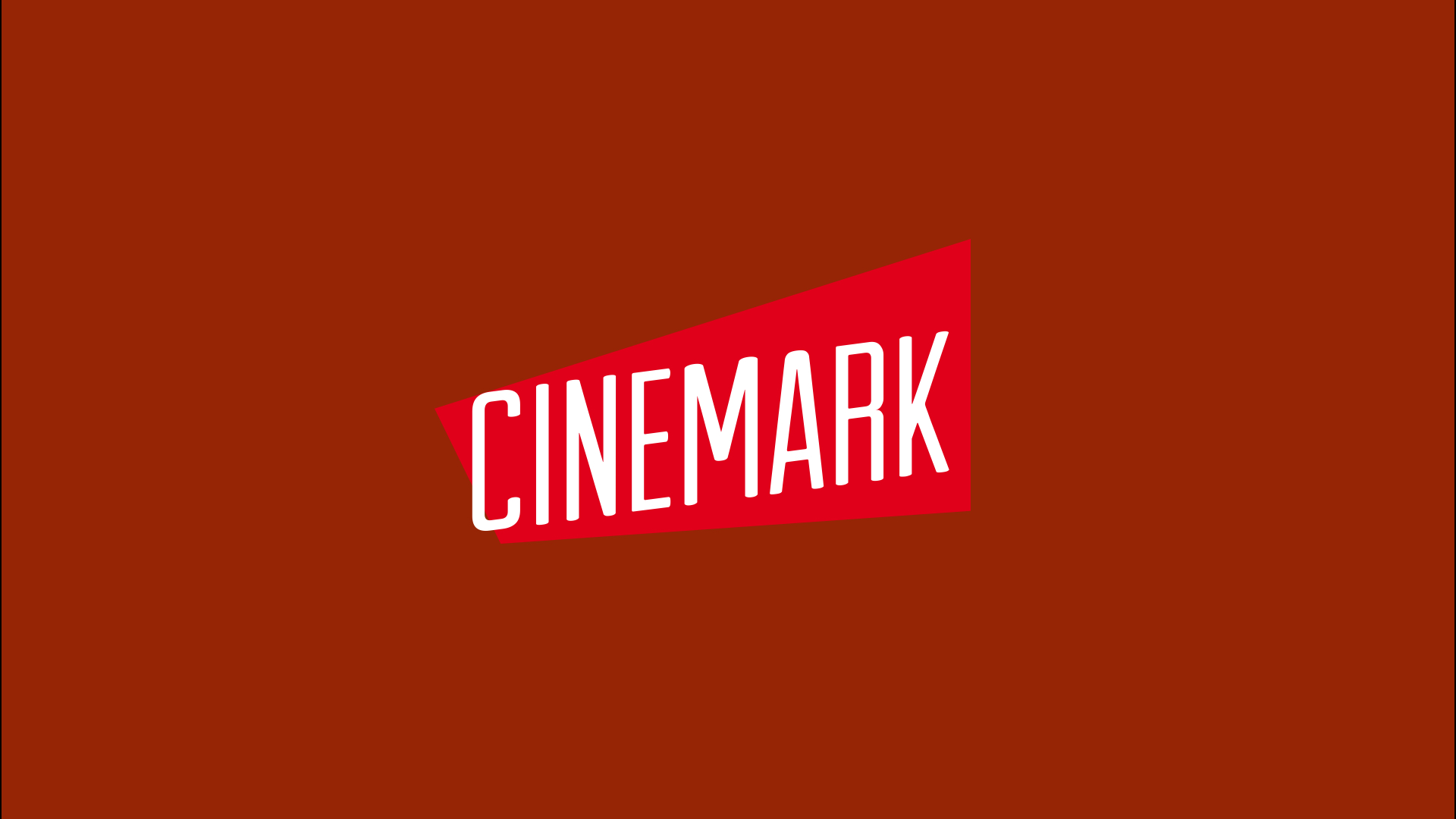
This was a design exercise that challenged me to do a redesign for Cinemark Theaters. I started by doing a slight re-design of the original design than did a full re-design. Cinemark is a classic movie theatre that caters to generations of viewers. Having a logo that could live in the modern era but shed light on the past was the top priority when designing the final version of the Cinemark logo.
Processing is a publication of my creation the explores the way we process subject matter that is usually hard to digest. This one mainly focuses on issues of race, sex, identity, and mental health.